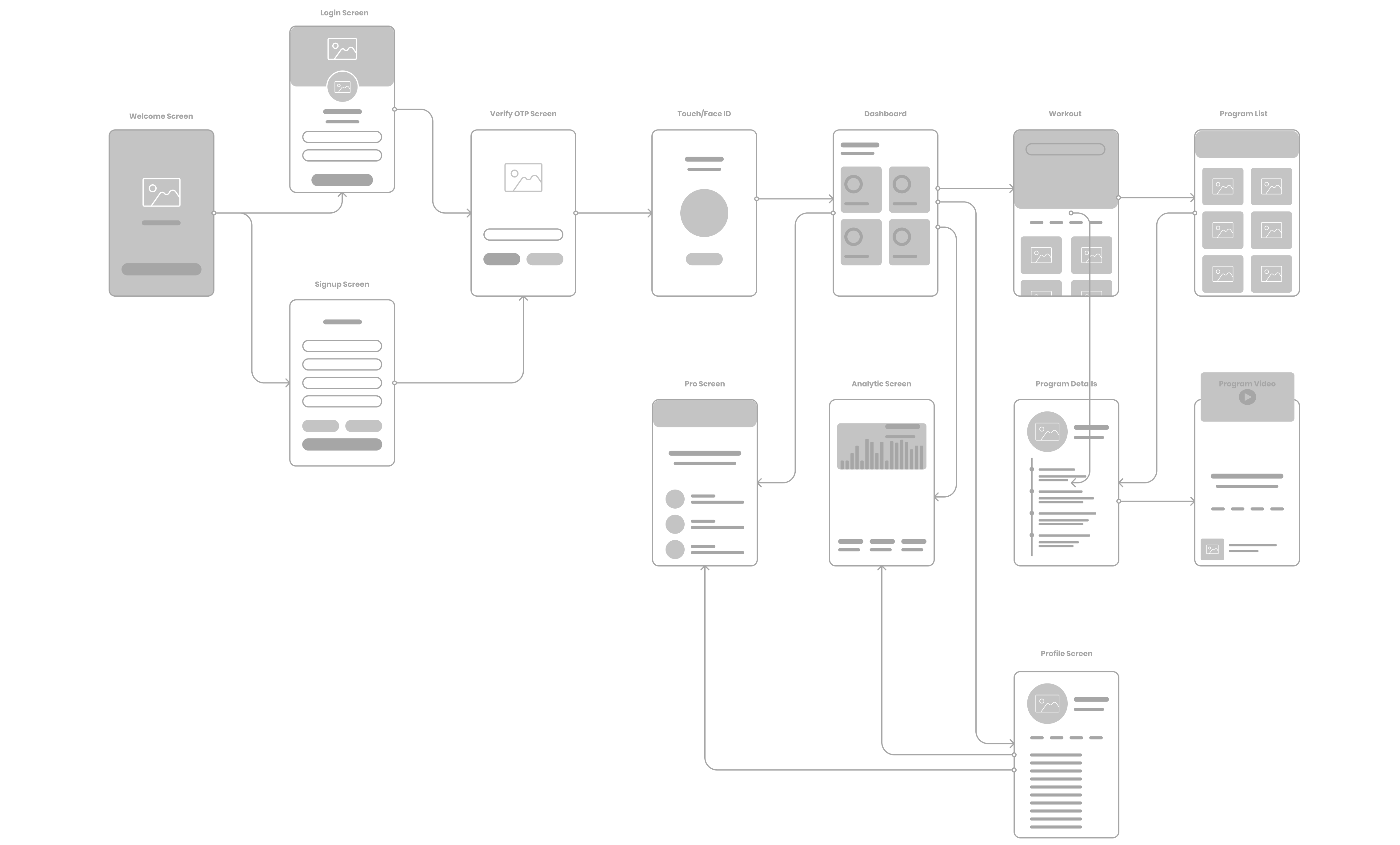
Hustl Fit

A comprehensive fitness app for enthusiasts looking to ignite their fitness journey, catering to both seasoned gym-goers and newcomers alike.

Role:

UX Designer,
User Researcher,
Graphics Designer

Time Frame:

Oct 2019 to
Jan 2020

Skills:

User Research,
UX Design,
Usability Testing,
Branding

Tools:

Figma, Balsamiq,
Miro,
Adobe Illustrator,
Zoom

Project Overview

The main objective of the client was to develop a comprehensive, mobile-friendly tool that would revolutionize the way companies operate by streamlining manual processes and maximizing productivity. The goal was to create a solution that would allow businesses to channel their time and resources into meaningful tasks rather than getting bogged down by time-consuming manual groundwork. My role involved reassessing and realigning the company's existing minimal viable product to ensure that it resonated with their core values and overarching business objectives.
...

Discovery Phase

Exploring Insights
& Opportunities .

In consideration of the budget limitations and the imperative to overhaul current screens, I meticulously strategized the user research to closely align with the client's exact requirements and preferences. To address this, we curated a plan that involved conducting the research with a limited sample of only three users. In order to obtain comprehensive and valuable insights, we chose to employ qualitative research methods, such as contextual inquiry and usability testing, given the potential need for a reassessment of certain screens and their approach. This strategy also encompassed the execution of moderated feedback sessions, allowing us to gather in-depth insights and feedback within a constrained time frame and user base.

Client Interview

In order to gain a thorough grasp of the project, we engaged in a series of in-depth client interviews conducted over the Zoom platform. These interviews played an invaluable role in gathering intricate insights into the client's overarching vision, objectives, and specific specifications for the screen redesign. The main purpose of these interviews was to comprehend the full scope of the project, its objectives, and any limiting factors. We delved into the client's vision for enhancing the user experience and overall functionality of the existing screens with a particular focus on augmenting usability, accessibility, and visual appeal to better cater to user needs.

Understanding the primary users of the application, their individual requirements, and pain points were vital considerations. We pinpointed key user scenarios that required attention in the redesign process. Furthermore, the client provided valuable feedback on existing screen issues, highlighting specific pain points and areas for improvement. Discussions also centered on the client's preferences regarding design style, branding, and visual elements. Emphasizing the need for efficient resource and time utilization within the bounds of the budget and timeline constraints was pivotal.

Competitor Analysis

Following the client interview, the next step involved stakeholder mapping to delineate the core, direct, and indirect users. This process identified key stakeholders such as renters, buyers, agents, agencies, and internal teams including development, marketing, sales, and support. Core users encompassed those directly engaging with the platform, while direct stakeholders consisted of internal teams crucial to operational success. Indirect stakeholders, represented by end-users, were pivotal in understanding broader market dynamics and user needs. This mapping facilitated a holistic approach to UX strategy, ensuring alignment with diverse stakeholder interests and enhancing overall project outcomes.

This mapping was facilitated using collaborative tools such as Miro for visualizing stakeholder relationships and Google Search Engine for gathering market insights and competitor data. These tools enabled a holistic approach to UX strategy, ensuring alignment with diverse stakeholder interests and enhancing overall project outcomes.

Research Phase

Uncovering User Needs
& Testing Hypothesis .

After thoroughly analyzing the USP of the screens designed and gathering valuable insights from key stakeholders within the company, I made the decision to delve into comprehensive research on numerous existing competitor products. Following this, I proceeded to conduct my own walk-a-mile session, which provided me with deeper insights and a better understanding of the platform.

User Personas

During the initial research phase, the first critical step we took was to thoroughly list out the user personas for the project. Each persona was carefully crafted to encapsulate their unique situation, context, goals, fears, and tasks. It's important to note that these user personas were distinct from the profiles derived from the extensive client interview sessions. The majority of the user personas represented three key user types, project/product manager Developer VoC specialist.

This helped me to better focus on conducting further research and making decisions by providing a clear reference point. In general, the user personas, when shared with the client, facilitated the development of empathy among the stakeholders, which ultimately resulted in more user-friendly and open engagement.

Empathy Map

The next step after lsiting the user persona was to conduct contextual inquiry to deepen our understanding of user needs and performing thorough usability testing of the current design. I structured this by providing users with a series of specific tasks to complete on the interface. During these sessions, I carefully observed and recorded each action, including both overt interactions and subtle behaviors, to gather detailed and accurate data. This meticulous documentation allowed me to identify and analyze user pain points, frustrations, and areas where the design could be improved. By capturing this rich, qualitative data, I was able to gain a profound insight into the user's experience, which informed further refinements and enhancements to better meet their needs and expectations.

User Interview + Voting

In addition to this, I also issued the System Usability Scale (SUS) test to gather quantitative data on the user experience of the application used by the customer. The SUS scores offered valuable insights into the overall usability of the design, helping to identify areas that may require improvement from a broader perspective. Combining this quantitative feedback with the qualitative data from the contextual inquiry allowed for a comprehensive evaluation of the design’s effectiveness and user satisfaction.

In addition to this, I also issued the System Usability Scale (SUS) test to gather quantitative data on the user experience of the application used by the customer. The SUS scores offered valuable insights into the overall usability of the design, helping to identify areas that may require improvement from a broader perspective. Combining this quantitative feedback with the qualitative data from the contextual inquiry allowed for a comprehensive evaluation of the design’s effectiveness and user satisfaction.

Ideation Phase

Shaping and Reinventing
Ideas .

During the ideation phase, I used insights from previous steps to create a customer journey map with the aim of improving the app experience for users. By incorporating research findings, we pinpointed critical pain points, user preferences, and opportunities for design enhancement. This foundational work guided our brainstorming sessions, where we worked together to define the core issues and explore innovative solutions to address them.

Key Findings

In light of the client's predetermined perceptions about the product, user intentions, and business strategy, it was crucial to construct a comprehensive high-level customer journey map. This powerful visualization not only enabled the client to readjust their focus but also empowered them to make meticulous, well-informed decisions regarding business strategies and feature enhancements.

Affinity Clustering

In light of the client's predetermined perceptions about the product, user intentions, and business strategy, it was crucial to construct a comprehensive high-level customer journey map. This powerful visualization not only enabled the client to readjust their focus but also empowered them to make meticulous, well-informed decisions regarding business strategies and feature enhancements.

Problem Statement

Based on the extensive research conducted, I initiated the process of listing problem statements, carefully organizing them under each persona to achieve more precise and targeted insights. This task involved a thorough analysis of the data collected from user persona, contextual inquiries, and usability testing. Each problem statement was articulated in detail to capture the nuances of user experiences and challenges with the current application. This detailed documentation was essential for a deep understanding of user needs and for identifying specific areas requiring improvement.

Throughout this process, I collaborated closely with the client to ensure alignment with their objectives and to incorporate their perspectives. Together, we reviewed and refined the problem statements, validating them against both user data and business goals. This collaborative approach helped to ensure that the problem statements were not only comprehensive but also relevant and actionable, paving the way for targeted design solutions and strategic enhancements.

Statement Starters + Voting

Following the detailed listing of problem statements, I created statement starters for each issue to facilitate clearer and more actionable descriptions. These starters helped to frame each problem statement in a way that highlighted key user concerns and design challenges.

To prioritize the issues, I organized a voting session with the client and relevant stakeholders. This collaborative exercise allowed us to focus on the most critical problem statements, ensuring that our design efforts were aligned with both user needs and business objectives. The voting process helped to identify the most impactful areas for improvement, guiding the subsequent design phases with targeted and well-prioritized goals.

Wireframe & Iteration

From Idea to
Visualization .

Methods used:

I delved into the critical stage of conceptualizing the user experience by examining it through the perspective of information architecture. Leveraging the power of Figma, I meticulously constructed intricate wireframes, acting as digital blueprints, for every screen and interaction. This iterative journey entailed constant fine-tuning of the wireframes in response to user feedback, ensuring that the design adeptly catered to user requirements and anticipations.

User Flow/IA

I developed our user flow based on user behavior, using insights from all the statement starters, solution arrived and principles of information architecture to organize the app's navigation and content for easy usability. By watching how users interacted with this structure, we were able to continually confirm the flow, improve navigation, and enhance the overall user experience. This process validated our information architecture decisions and helped us create a smooth and efficient user journey that meets user expectations and improves usability. Furthermore, we confirmed the user flow and the entity relationship to ensure that all interactions and data relationships were accurately mapped and aligned with user needs.

Wireframing

After gathering a lot of data from user research, contextual inquiries, and usability testing, I started working on the wireframes. Using the detailed insights I gathered, I focused on addressing the identified issues and user preferences. I used Figma to design detailed wireframes that served as digital blueprints for each screen and interaction within the app. This involved creating an initial set of wireframes and then refining them based on user feedback and further testing to ensure they effectively met user needs and expectations. The wireframes provided a clear visualization of the user journey, allowing for a structured and user-centric design approach.

To ensure the effectiveness of the wireframes, I tested them with users, employing the System Usability Scale (SUS) to gather quantitative feedback. This testing phase allowed us to gain valuable insights into how users interacted with the wireframes, identifying any areas of confusion or difficulty. Based on this feedback, I made necessary iterations to the wireframes, continually refining them to enhance usability and align with user expectations. Once the wireframes were thoroughly tested and optimized, we proceeded to the next steps, confident that the design was both user-friendly and effective.

Final Design

Turning Insights into a
Refined Experience .

After successfully creating the wireframes, the next step involved making changes to the brand colors to ensure accessibility and adherence to color psychology principles. Given that the client already had an established design system, I focused on adjusting the color palette to improve visual accessibility and user experience. Additionally, I modified the logo to align with the updated color scheme and created some illustration guides to maintain consistency across the app. These changes not only enhanced the overall aesthetic appeal but also ensured that the design was inclusive and engaging for all users.

Color & Typography

By conducting extensive research, I carefully evaluated and harmonized the main needs of different user groups with the overarching capabilities. This comprehensive approach ensured the creation of a powerful and efficient branding system that not only met user expectations but also leveraged color psychology principles to enhance visual appeal and accessibility. Additionally, I utilized visual guidelines to maintain consistency across all design elements. The result was a cohesive and impactful brand identity that resonated with users and supported the company's strategic goals.

I utilized mind-mapping technique to brainstorm and generate innovative ideas, leading to a successful redesign of the logo. The new logo serves as a powerful representation of the inception of ideas brought forth by the collaborative efforts of diverse individuals, organizational components, and cohesive teams. Additionally, I skillfully crafted custom illustrations using Adobe Illustrator to enhance the visual identity and seamlessly align with the overall branding strategy.

Logo & Pattern Psychology

I utilized mind-mapping technique to brainstorm and generate innovative ideas, leading to a successful redesign of the logo. The new logo serves as a powerful representation of the inception of ideas brought forth by the collaborative efforts of diverse individuals, organizational components, and cohesive teams. Additionally, I skillfully crafted custom illustrations using Adobe Illustrator to enhance the visual identity and seamlessly align with the overall branding strategy.

High-Fidelity Mocks

I utilized UsabilityHub to test my design iterations through various A/B tests. These included a task-based navigation test to evaluate navigability and reachability, and an information hierarchy preference test to identify the most preferred organizational layout. By incorporating key insights from these tests, as well as data on branding and user feedback, I refined my designs. I then integrated the successful changes, transforming the refined iterations into the final mocks, ensuring a cohesive and user-friendly design. Each solution is meticulously grounded in design laws and psychological principles to ensure their effectiveness and relevance.

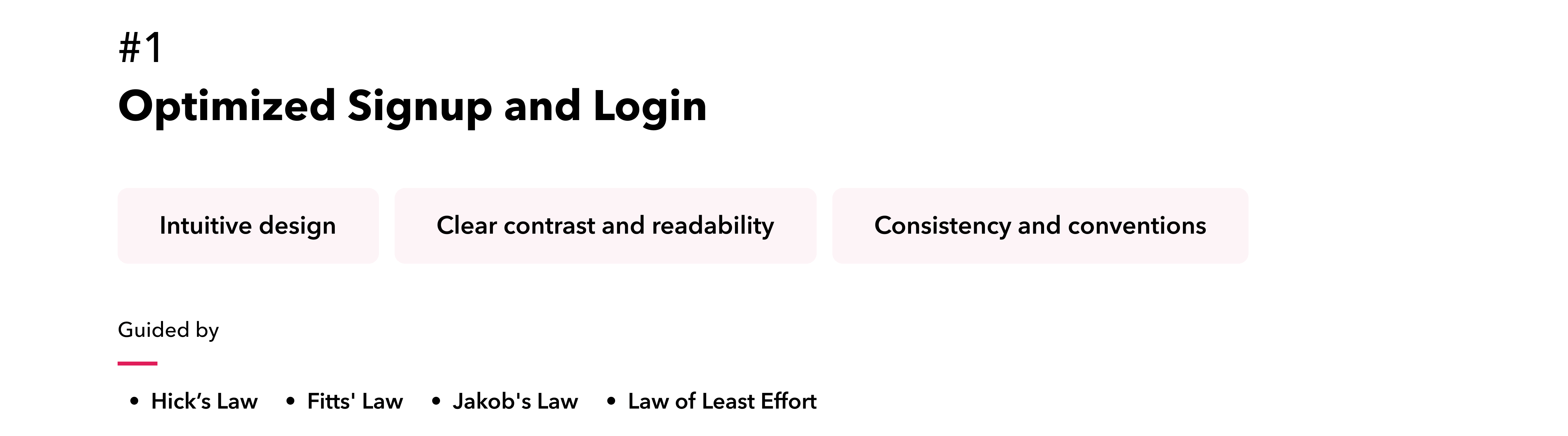
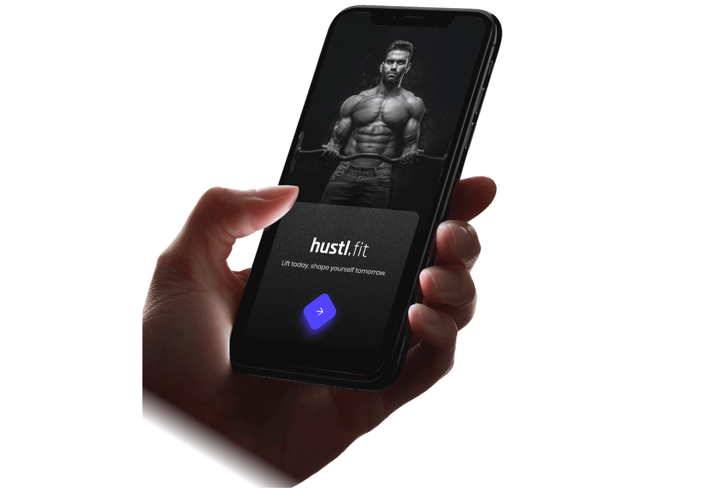
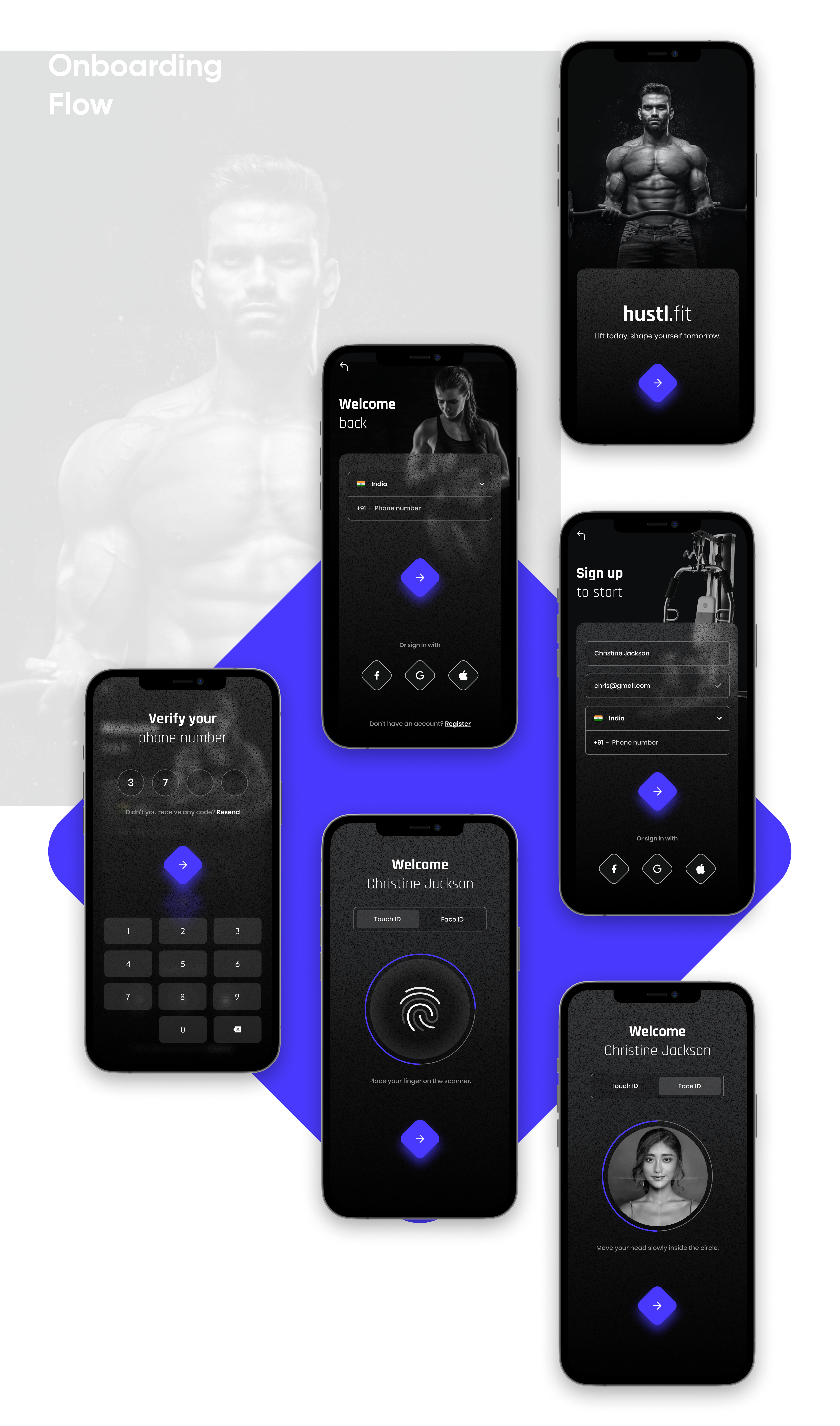
By addressing user needs, we redesigned the user onboarding flow to enhance clarity and efficiency. The updated process features clear, concise copy that aligns with the user’s mental model, guiding them smoothly through signup and login. Strategically placed CTAs and consistent, informative messages provide actionable feedback, improving readability and user interaction. The integration of social login options and a streamlined password recovery process further boosts convenience, ensuring a coherent and user-friendly experience.

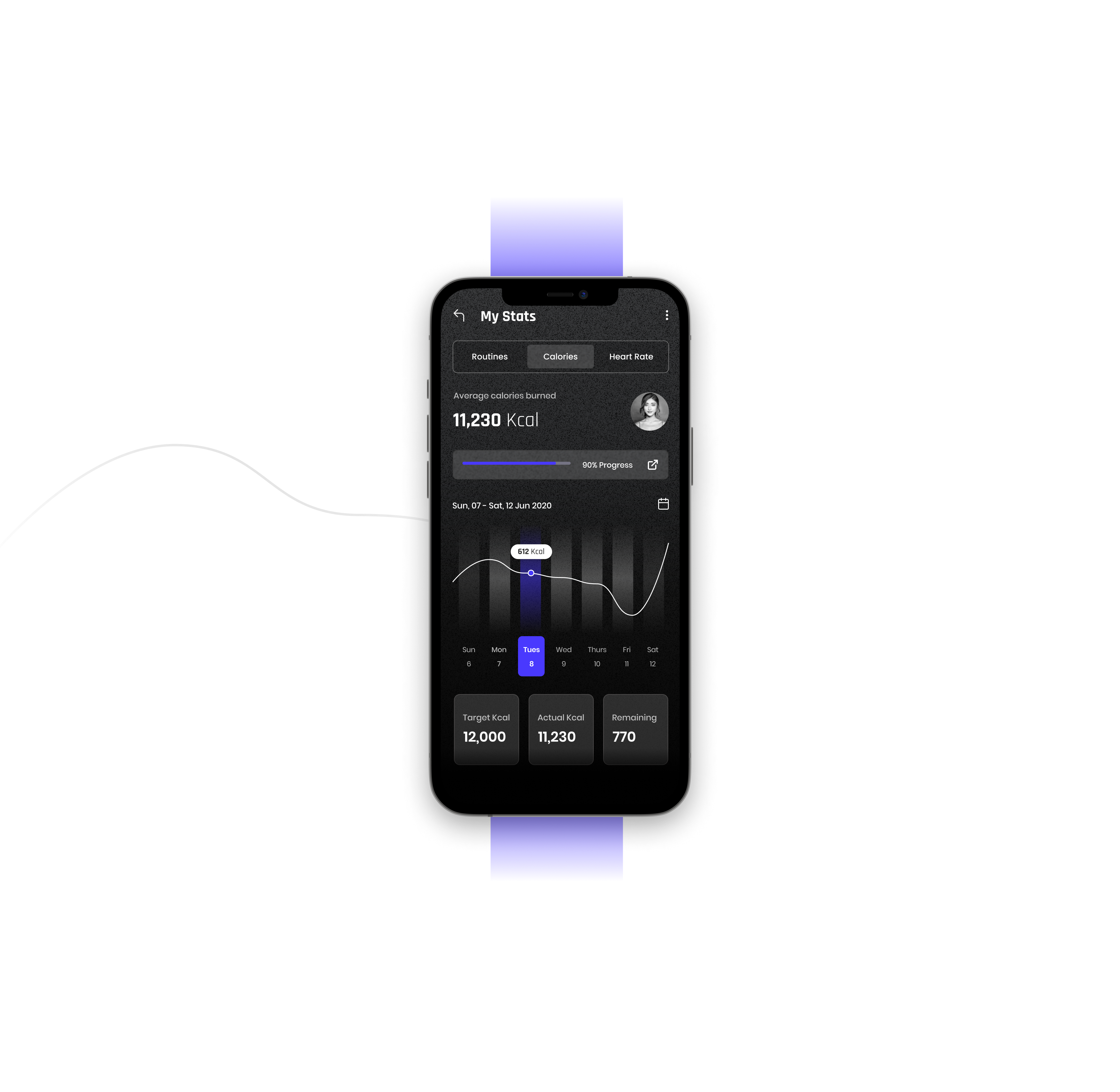
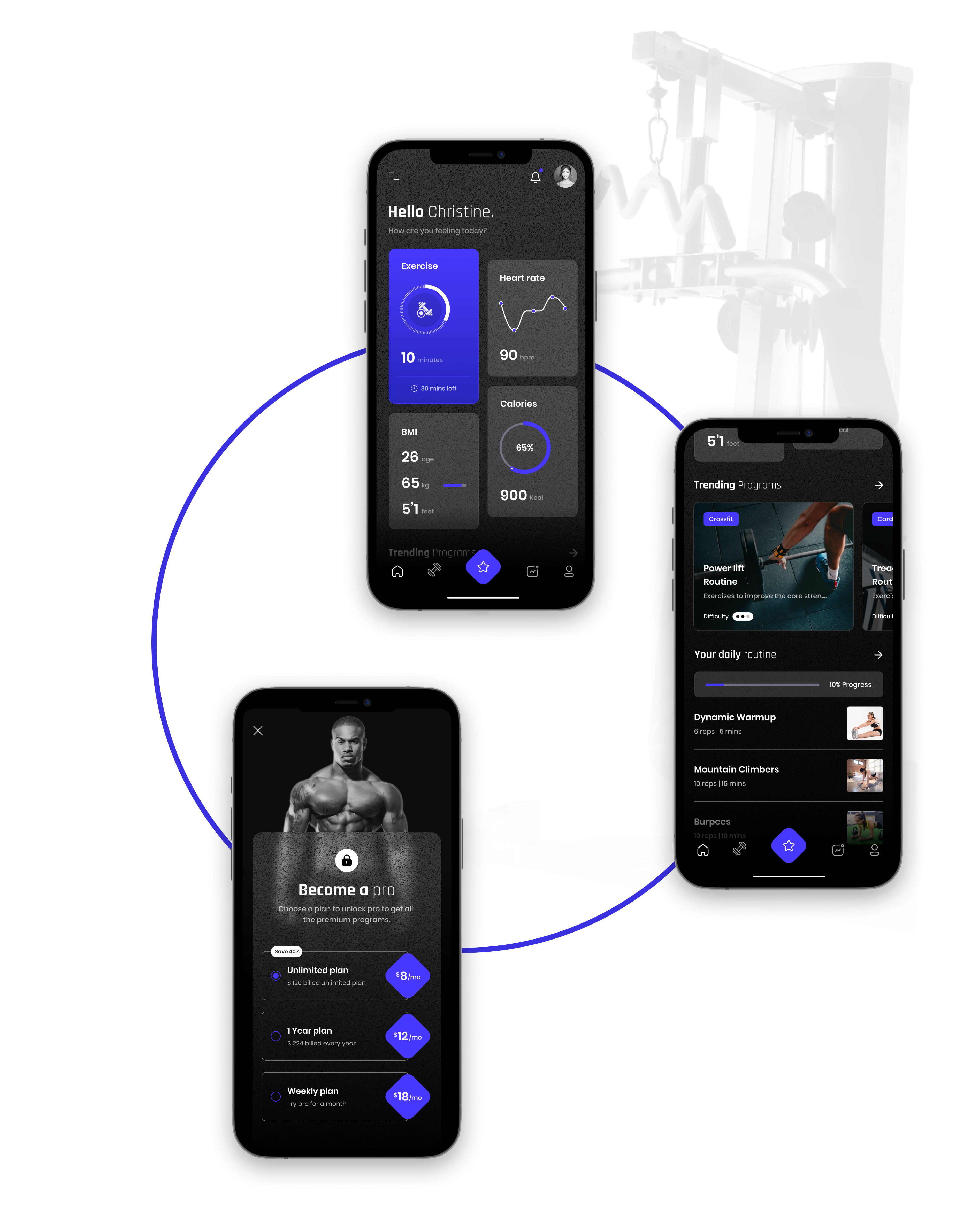
The dashboard was redesigned to be more efficient and user-friendly by effectively grouping related data and using clear visual cues, enabling users to quickly identify important information and understand relationships between data points. Consistent visual elements for similar data types and clear distinctions between elements enhances accurate and efficient data interpretation. Interactive elements were strategically placed, and user options were kept to the point to streamline the experience.By balancing complexity with usability and maintaining consistent design patterns and interactions, users can easily navigate and comprehend the information presented.

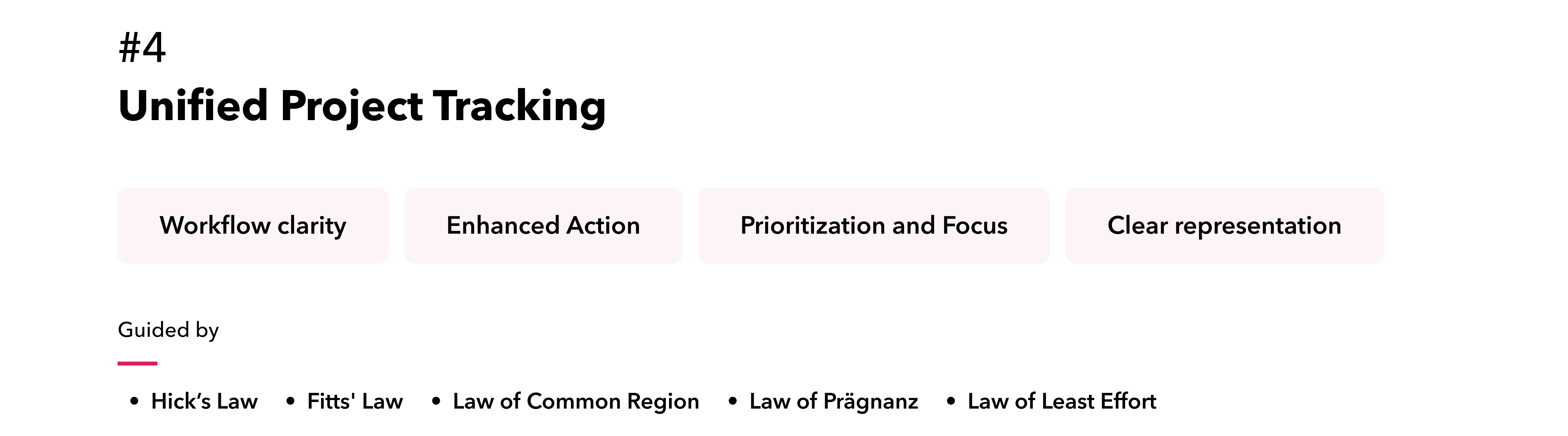
To enhance task management and comprehension, we implemented a well-defined task hierarchy using visual cues such as indentation, headings, and consistent styling, which clarifies task levels and dependencies. We also incorporated advanced data visualization method of swimlane views, to provide users with a comprehensive understanding of task timelines and project progress. Intuitive, clear, and visually categorized color-coded project markers offer a transparent overview of task tracking and required actions, streamlining user interaction and improving overall task management.

To enhance the project board, we introduced several key features. Distinct colors and labels differentiate each stage, and stages are limited to essential ones to reduce complexity. Clear visual indicators facilitate reordering within stages. Real-time notifications for assignments, comments, and status changes keep users informed. Essential details such as assignee and due date are visible on cards, and progress bars show completion status, all of which improve overall management and user experience.

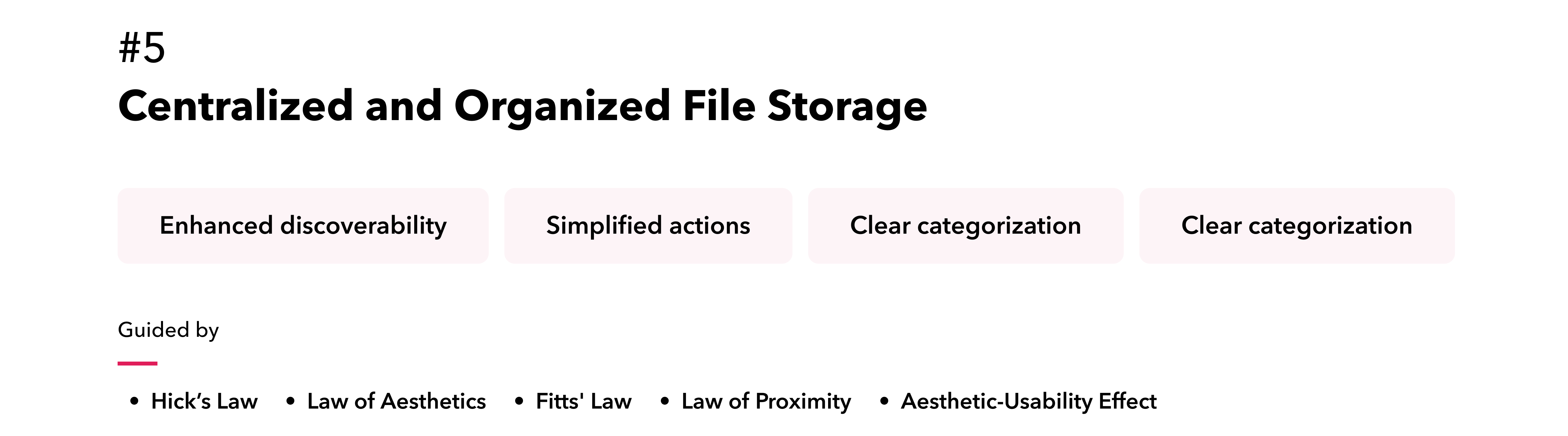
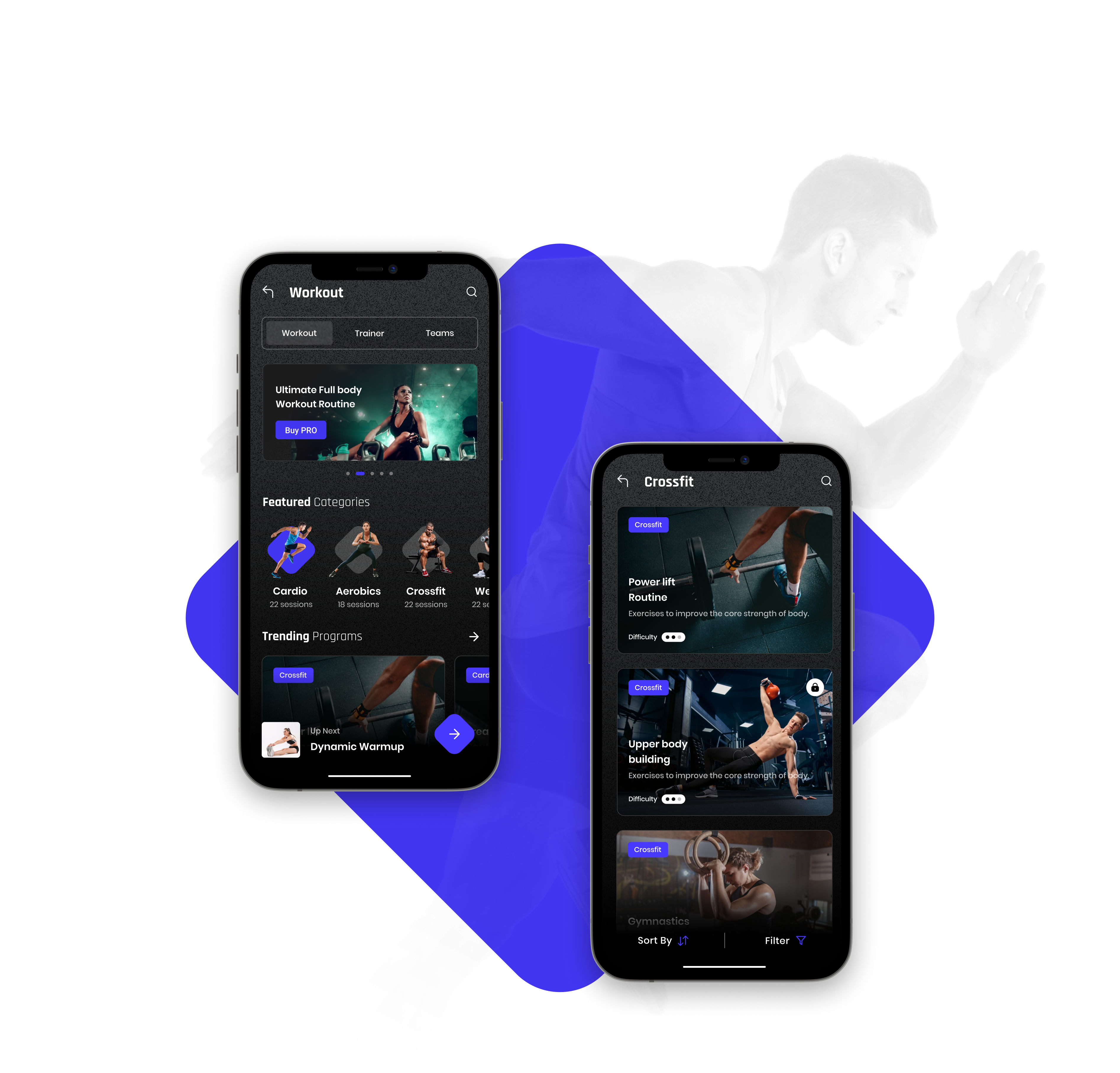
We redesigned the file screen to feature clear folder structures, intuitive navigation, and visually appealing hierarchies, significantly enhancing discoverability. The file storage system has been seamlessly integrated, ensuring a smooth and cohesive user experience. This integration view supports efficient file management through streamlined actions, optimized storage space, and a unified approach to organizing and accessing files.

Conclusion

Elevating
User Satisfaction .

The redesign of the tool was a resounding success, as evidenced by the positive user feedback and an exceptional average SUS score of 87. By addressing usability pain points and enhancing the overall user experience, the project has empowered users to interact with the tool more efficiently and effectively. The increased user satisfaction has directly contributed to the client's ability to secure additional funding, demonstrating the tangible impact of design on business outcomes. The client's expressed satisfaction with the project serves as a testament to the successful collaboration between the design team and the client throughout the project lifecycle.